
Odczaruj Power BI
odczarujpowerbi.pl
What the site had to do
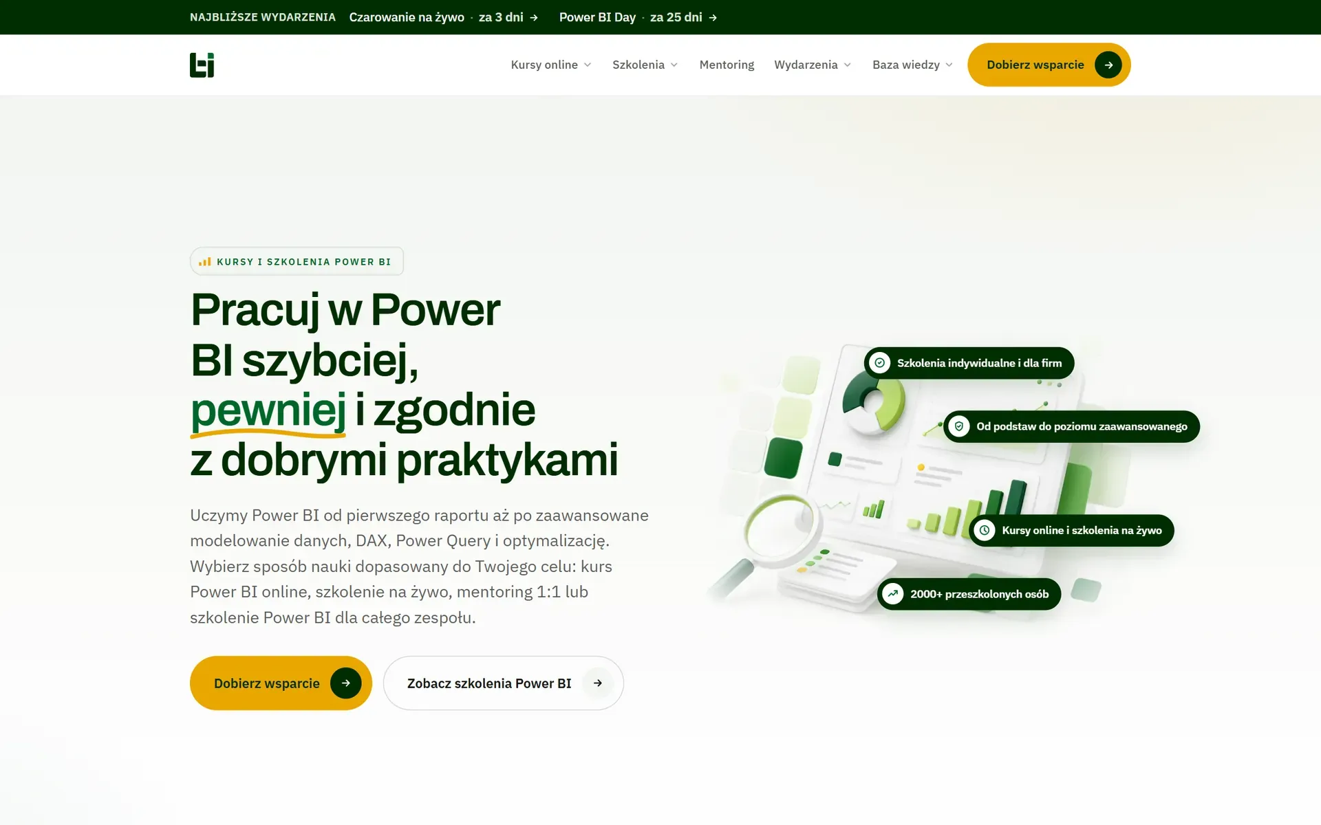
Online courses, corporate training, 1:1 mentoring, an ebook, webinars and a blog: six products for three audiences. The biggest risk with an offer like this is choice paralysis. Someone lands, sees ten paths and clicks none.
- Industry
- Education, online courses
- Scope
- Information architecture and build
- Pages
- 10 + blog
- Goal
- A course purchase or a diagnosis request
What we did, and why this way
- 1
A profile instead of a menu
Right under the hero, three situations: you work with data, you own the reports, you run the team. The visitor picks themselves and only then gets the right offer.
- 2
A diagnosis for the undecided
Anyone who doesn't know where to start gets a short diagnosis instead of a price list. A soft entry for ad traffic and a list of people worth following up with.
- 3
Every format has its own address
Courses, training, mentoring and events each have their own page and button. Ads land straight on the format the customer is already considering.
Inside the site
Click a frame to view it full screen.

Tell us what you sell
Two or three sentences are enough: what you do, who for and what should change. We'll reply with an idea and a ballpark quote. The conversation commits you to nothing.

Contact directly
We usually reply within a day, faster on weekdays.