
A landing page that doesn't burn the ad budget
Who it's for: Businesses paying for Google or Meta ads and sending that traffic to a home page or a profile.
What you get out of it
- The ad's promise repeated in the headline, so no letdown after the click
- One action on the page, no menu leaking traffic away
- Objections handled in the order they actually come up
- Conversion events wired in, so you know what pays off
Specifics, no asterisked packages
A landing page has one job: turn a paid click into a contact. There's no navigation, no company history and no blog. Just the promise, proof, answers to objections and a form, repeated often enough that nobody has to scroll back up.
How we do it
The headline says exactly what the ad said
If the ad promises a “free trial session”, that's the first sentence on the page, not “welcome to our website”. That single match decides whether someone stays or bounces back to the results.
Navigation switched off so there are no exits
A standard menu on a landing page works like a fire door. One path remains: the form or the phone, repeated after every section, including right after the one that handles the biggest objection.
You see what a contact costs
Form submissions and taps on the number are tracked as conversions, so after a week you see cost per contact, not just cost per click. Without that you're optimising blind.
Sites we've already built
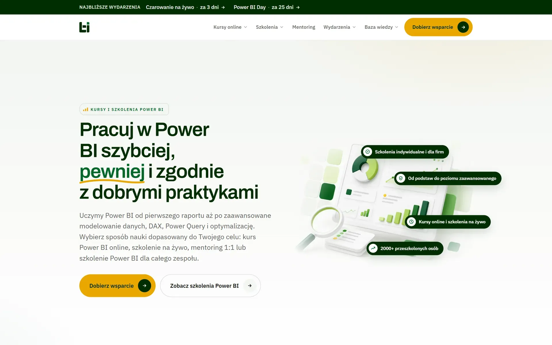
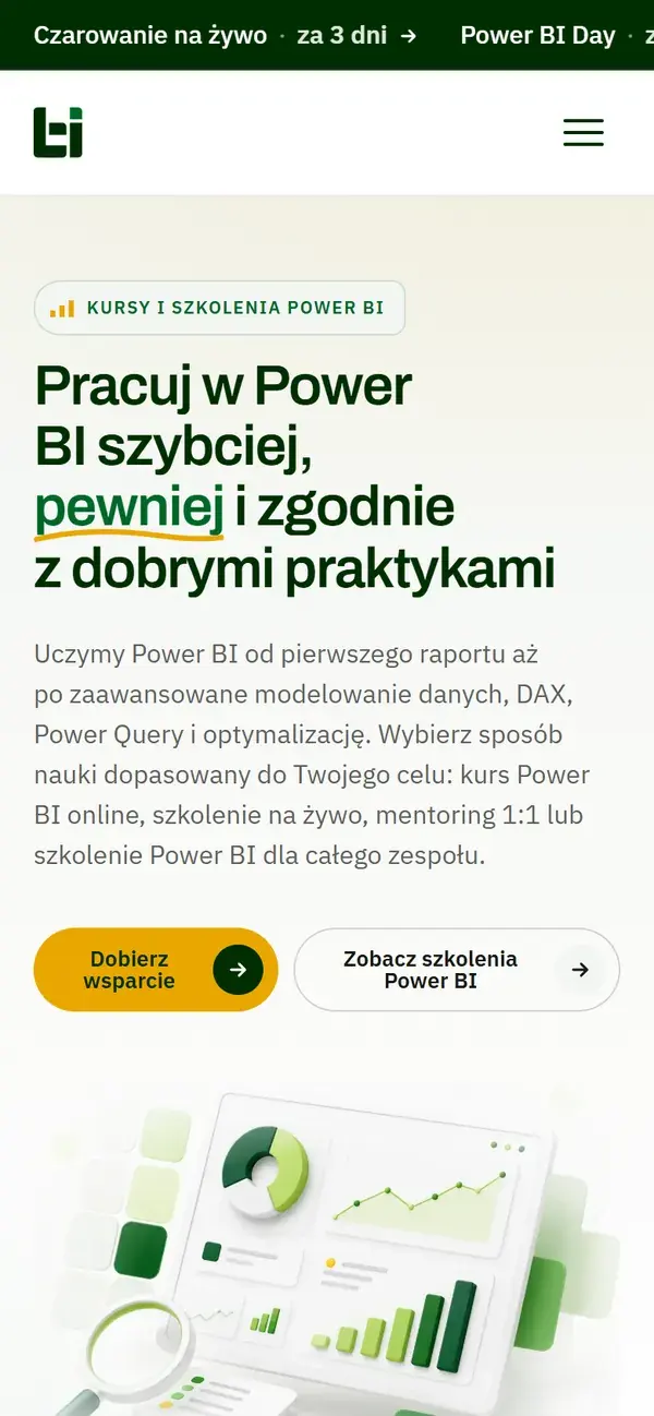
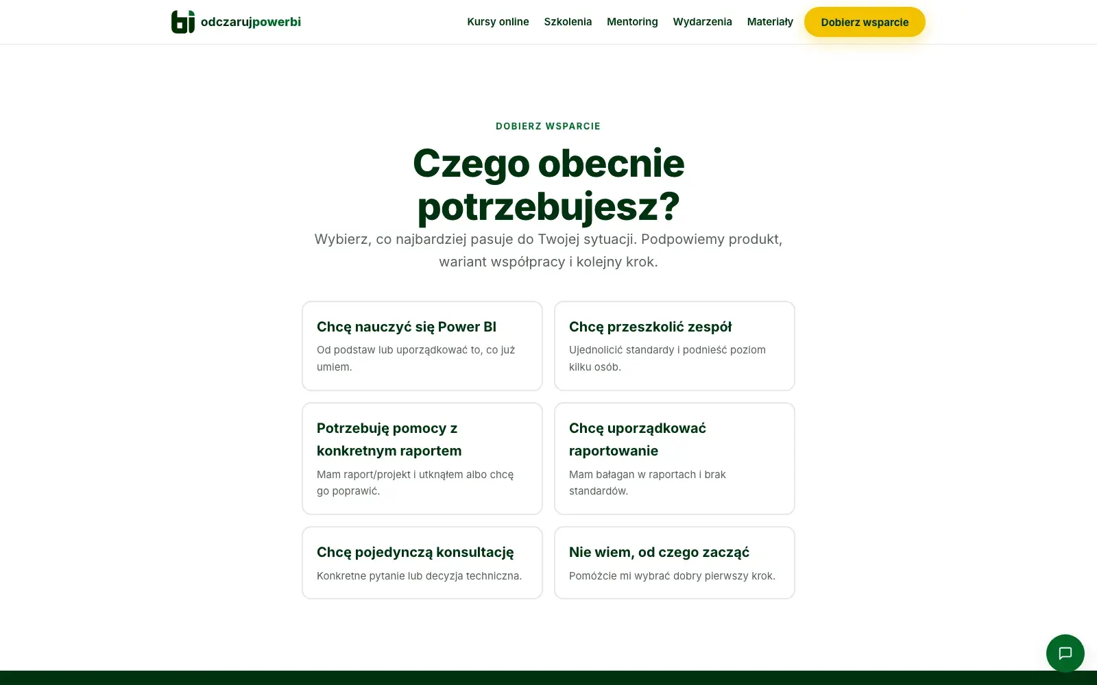
Online trainingodczarujpowerbi.pl
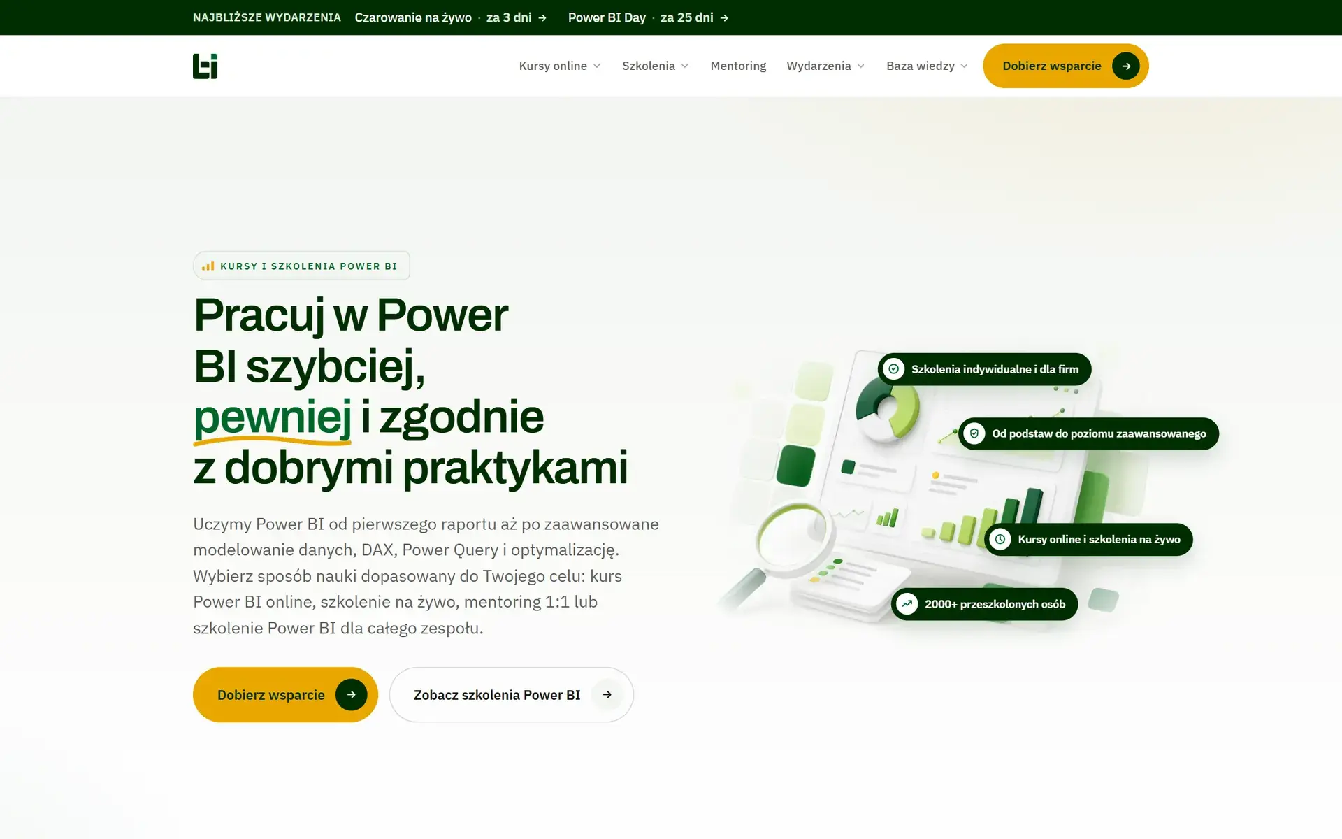
Odczaruj Power BI
Power BI courses, corporate training and mentoring. Six products arranged so everyone reaches theirs in one step.
Craftwedki.pl
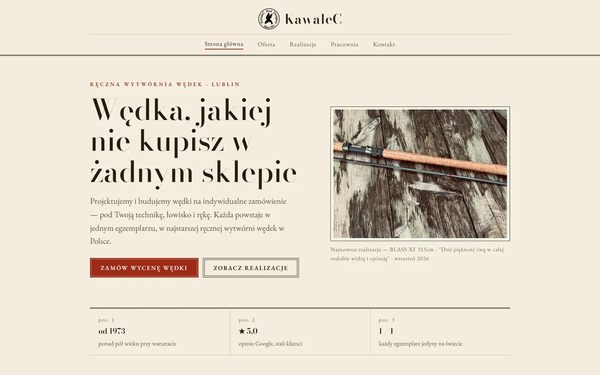
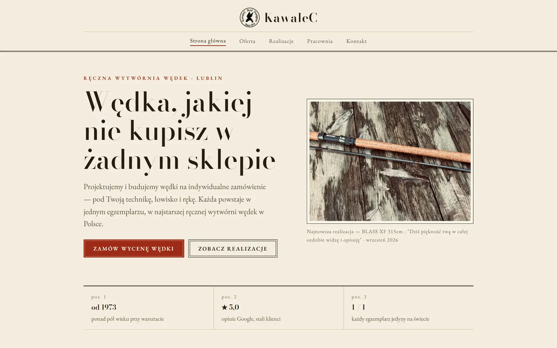
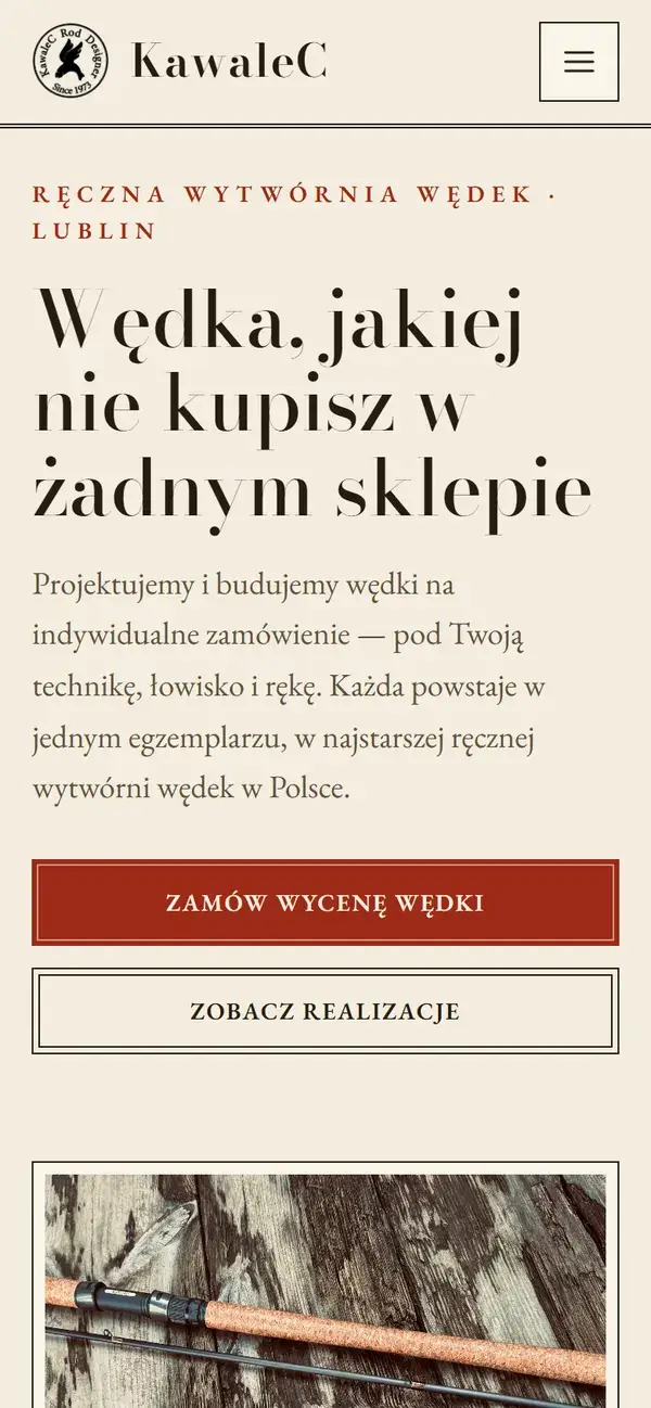
Kawalec, wędki na zamówienie
Poland's oldest handmade fishing-rod workshop, running since 1973. The site reads like a craftsman's catalogue with one path to a quote.
Tell us what you sell
Two or three sentences are enough: what you do, who for and what should change. We'll reply with an idea and a ballpark quote. The conversation commits you to nothing.

Contact directly
We usually reply within a day, faster on weekdays.